Hi there! It’s still us! Recognize any changes around here?
Good! We hoped you might…
As you can see, we’ve been up to something – and we are so excited to finally show you what has been keeping us busy for the better part of a year.
After months of planning, designing, testing, and focus-grouping, we are thrilled to welcome you to the new JoeAndruzziFoundation.org website. But before we get into that, let’s talk about the catalyst for our new makeover: JAF’s new branding.
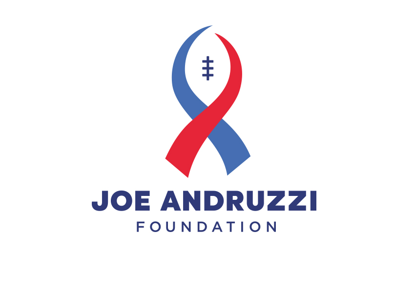
Front and center of the rebrand is a new JAF logo – a significant departure from its two previous iterations, both of which prominently had featured a silhouette of Joe, football helmet, pads and all, triumphantly raising his hand towards the sky.
Back in 2013, we relaunched the brand as part of highlighting JAF’s “(Up)Beat Cancer” mantra – an initiative that fully expressed who JAF is as an organization: fun, full of laughter and happiness. For the past five years, we have been absolutely blown away by how our supporters and patients have embraced JAF’s upbeat philosophy and used it to spread our mission. And while our new logo no longer includes the “(Up)Beat Cancer” slogan, its importance and relation to JAF certainly isn’t going anywhere.
The new Joe Andruzzi Foundation logo expresses the Foundation’s warmth, dedication, and positive approach to cancer support combined with a subtle but central reference to Joe’s football career – the sport that gave Joe a platform to speak from when he and Jen launched the Foundation nearly 10 years ago.
Two awareness ribbon-like figures are overlaid to form the shape of a football. Surrounding the ribbons are large, bold-face characters spelling out the Foundation’s name. Its simplicity directly addresses the feedback we heard from our stakeholders and advisors throughout the rebranding process: that JAF is a strong, authentic, and bold organization. We feel our new logo embodies those things and leaves little doubt to who we are and what we represent.
As mentioned previously, our “upbeat” messaging will not be lost – it will be communicated in tone throughout everything we do. The core of JAF’s mission is staying intact as well. Our goals continue to be aligned with finding resources to provide financial support to New England cancer patients and their families with dedication rooted in personal experience. We are upbeat, responsive, strong, and trusted by patients and caregivers, and our brand will continue to represent our fight to relieve the financial burden cancer treatment often causes so that patients and their families can focus on what matters most: getting better.
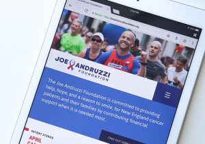
And what better way to launch the rebrand than through a new website – thanks to our creative and brilliant partners at Opus Design (who oversaw the logo redesign as well).
As we all know, technology is constantly evolving, and our previous website was due for some upgrades to better serve how our constituents and partners leverage it. The layout is cleaner. The navigation easily translates to mobile and tablet viewing. And we’ve put a much bigger emphasis on storytelling – through sharing JAF Patient Stories or video testimonials.
So, do us a favor – browse around, see what you like, and let us know what you think.
Together, we’ve come so far in 10 years, and we can’t wait to see what the next decade has in store.